Phoenix 1.7.14 - User Info within Darkmode Toggle
Implement Manual Darkmode Toggle using Tailwind CSS and include User Information
This article assumes you have read the previous articles:
Code for this article can be found at: https://github.com/btihen-dev/phoenix_toggle_theme
Adding User Info (Login / Logout)
First we can run the auth generator to have a the sign-up/login/logout features.
$ mix phx.gen.auth Accounts User users
$ mix deps.get
$ mix ecto.migrate
using:
mix phx.routes
# we see our new routes (for now we only care about the following:)
GET    /users/register DarktoggleWeb.UserRegistrationLive  :new
GET    /users/log_in   DarktoggleWeb.UserLoginLive         :new
DELETE /users/log_out  DarktoggleWeb.UserSessionController :delete
We see this generator added to root.html.heex:
<ul class="relative z-10 flex items-center gap-4 px-4 sm:px-6 lg:px-8 justify-end">
  <%= if @current_user do %>
    <li class="text-[0.8125rem] leading-6 text-zinc-900">
      <%= @current_user.email %>
    </li>
    <li>
      <.link
        href={~p"/users/settings"}
        class="text-[0.8125rem] leading-6 font-semibold p-2.5 rounded-lg text-grey-800 hover:bg-gray-100 dark:text-gray-200 dark:hover:bg-gray-700 dark:hover:text-gray-300"
      >
        Settings
      </.link>
    </li>
    <li>
      <.link
        href={~p"/users/log_out"}
        method="delete"
        class="text-[0.8125rem] leading-6 font-semibold p-2.5 rounded-lg text-grey-800 hover:bg-gray-100 dark:text-gray-200 dark:hover:bg-gray-700 dark:hover:text-gray-300"
      >
        Log out
      </.link>
    </li>
  <% else %>
    <li>
      <.link
        href={~p"/users/register"}
        class="text-[0.8125rem] leading-6 font-semibold p-2.5 rounded-lg text-grey-800 hover:bg-gray-100 dark:text-gray-200 dark:hover:bg-gray-700 dark:hover:text-gray-300"
      >
        Register
      </.link>
    </li>
    <li>
      <.link
        href={~p"/users/log_in"}
        class="text-[0.8125rem] leading-6 font-semibold p-2.5 rounded-lg text-grey-800 hover:bg-gray-100 dark:text-gray-200 dark:hover:bg-gray-700 dark:hover:text-gray-300"
      >
        Log in
      </.link>
    </li>
  <% end %>
</ul>
we want to move this into our navbar component (right next to our toggle button).
First, we can pass information into the navbar component using by adusting the navbar call in root.html.heex to:
<AvkServiceWeb.Components.Navbar.render
  current_user={@current_user}
/>
With a few adjustments to the generated code to work with our navbar(I won’t cover the details, but you can see the changes below). The navbar now looks like:
# lib/darktoggle_web/components/navbar.ex
defmodule DarktoggleWeb.Components.Navbar do
  use DarktoggleWeb, :html

  def render(assigns) do
    ~H"""
    <header class="absolute sticky inset-x-0 top-0 z-50 w-full">
      <nav class="border-b-4 border-orange-600">
        <div class="mx-auto max-w-7xl px-2 lg:px-6 xl:px-8">
          <div class="relative flex h-20 items-center justify-between">
            <div class="absolute inset-y-0 left-0 flex items-center lg:hidden">
              <!-- Mobile menu button-->
              <button
                type="button"
                phx-click={JS.toggle(to: "#mobile-menu")}
                class="relative inline-flex items-center justify-center rounded-lg p-2  text-grey-800 hover:bg-gray-100 dark:text-gray-200 dark:hover:bg-gray-700 dark:hover:text-gray-300 focus:outline-none focus:ring-2 focus:ring-inset focus:ring-white"
                aria-controls="mobile-menu"
                aria-expanded="false"
              >
                <span class="absolute -inset-0.5"></span>
                <span class="sr-only">Open main menu</span>
                <!-- Icon when menu is closed. - Menu open: "hidden", Menu closed: "block" -->
                <svg
                  class="block h-6 w-6"
                  fill="none"
                  viewBox="0 0 24 24"
                  stroke-width="1.5"
                  stroke="currentColor"
                  aria-hidden="true"
                >
                  <path
                    stroke-linecap="round"
                    stroke-linejoin="round"
                    d="M3.75 6.75h16.5M3.75 12h16.5m-16.5 5.25h16.5"
                  />
                </svg>
                <!-- Icon when menu is open. - Menu open: "block", Menu closed: "hidden" -->
                <svg
                  class="hidden h-6 w-6"
                  fill="none"
                  viewBox="0 0 24 24"
                  stroke-width="1.5"
                  stroke="currentColor"
                  aria-hidden="true"
                >
                  <path stroke-linecap="round" stroke-linejoin="round" d="M6 18L18 6M6 6l12 12" />
                </svg>
              </button>
            </div>
            <div class="hidden lg:flex lg:items-center lg:space-x-4">
              <.link
                href={~p"/"}
                class="rounded-lg px-3 py-2 text-md font-medium text-grey-800 hover:bg-gray-100 dark:text-gray-200 dark:hover:bg-gray-700 dark:hover:text-gray-300"
              >
                Home
              </.link>
              <.link
                href={~p"/dev/dashboard"}
                class="rounded-lg px-3 py-2 text-md font-medium text-grey-800 hover:bg-gray-100 dark:text-gray-200 dark:hover:bg-gray-700 dark:hover:text-gray-300"
              >
                Dashboard
              </.link>
              <.link
                href={~p"/dev/mailbox"}
                class="rounded-lg px-3 py-2 text-md font-medium text-grey-800 hover:bg-gray-100 dark:text-gray-200 dark:hover:bg-gray-700 dark:hover:text-gray-300"
              >
                Mailbox
              </.link>
            </div>
            <div class="absolute left-1/2 transform -translate-x-1/2 flex items-center">
              <.link
                href={~p"/"}
                class="-m-1.5 p-2.5 flex items-center rounded-lg text-grey-800 hover:bg-gray-100 dark:text-gray-200 dark:hover:bg-gray-700 dark:hover:text-gray-300"
              >
                <img class="h-8 w-auto" src={~p"/images/logo.svg"} alt="logo" />
                <span class="ml-4 text-2xl font-bold">Toggle Theme</span>
              </.link>
            </div>
            <div class="absolute inset-y-0 right-0 flex items-center pr-2 lg:static lg:inset-auto lg:ml-6 lg:pr-0">
              <ul class="relative z-10 flex items-center gap-2 px-1 sm:px-4 lg:px-6 justify-end">
                <%= if @current_user do %>
                  <li class="text-sm hidden lg:block leading-6 text-zinc-900 dark:text-gray-400">
                    <%= @current_user.email %>
                  </li>
                  <li>
                    <.link
                      href={~p"/users/settings"}
                      class="text-md leading-6 hidden lg:block font-semibold p-2.5 rounded-lg text-grey-800 hover:bg-gray-100 dark:text-gray-200 dark:hover:bg-gray-700 dark:hover:text-gray-300"
                    >
                      Settings
                    </.link>
                  </li>
                  <li>
                    <.link
                      href={~p"/users/log_out"}
                      method="delete"
                      class="text-md leading-6 font-semibold p-2.5 rounded-lg text-grey-800 hover:bg-gray-100 dark:text-gray-200 dark:hover:bg-gray-700 dark:hover:text-gray-300"
                    >
                      Log out
                    </.link>
                  </li>
                <% else %>
                  <li>
                    <.link
                      href={~p"/users/register"}
                      class="text-md leading-6 hidden md:block font-semibold p-2.5 rounded-lg bg-orange-400 text-gray-800 hover:bg-orange-300 dark:bg-orange-600 dark:text-gray-200 dark:hover:bg-orange-700"
                    >
                      Register
                    </.link>
                  </li>
                  <li>
                    <.link
                      href={~p"/users/log_in"}
                      class="text-md leading-6 font-semibold p-2.5 rounded-lg text-grey-800 hover:bg-gray-100 dark:text-gray-200 dark:hover:bg-gray-700 dark:hover:text-gray-300"
                    >
                      Log in
                    </.link>
                  </li>
                <% end %>
              </ul>
              <DarktoggleWeb.Components.ToggleTheme.render />
            </div>
          </div>
        </div>
        <!-- Mobile menu, show/hide based on menu state. -->
        <div class="lg:hidden hidden" id="mobile-menu">
          <div class="space-y-1 px-2 pb-3 pt-2">
            <.link
              href={~p"/users/register"}
              class="block rounded-lg px-3 py-2 text-base font-bold text-orange-600 hover:bg-gray-100 dark:hover:bg-gray-700 dark:hover:text-gray-300"
            >
              Register
            </.link>
            <.link
              href={~p"/"}
              class="block rounded-lg px-3 py-2 text-base font-medium text-grey-800 hover:bg-gray-100 dark:text-gray-200 dark:hover:bg-gray-700 dark:hover:text-gray-300"
            >
              Home
            </.link>
            <.link
              href={~p"/dev/dashboard"}
              class="block rounded-lg px-3 py-2 text-base font-medium text-grey-800 hover:bg-gray-100 dark:text-gray-200 dark:hover:bg-gray-700 dark:hover:text-gray-300"
            >
              Dashboard
            </.link>
            <.link
              href={~p"/dev/mailbox"}
              class="block rounded-lg px-3 py-2 text-base font-medium text-grey-800 hover:bg-gray-100 dark:text-gray-200 dark:hover:bg-gray-700 dark:hover:text-gray-300"
            >
              Mailbox
            </.link>
            <%= if @current_user do %>
              <p class="px-3 py-2 text-sm leading-6 text-zinc-900 dark:text-gray-400">
                <%= @current_user.email %>
              </p>
              <.link
                href={~p"/users/settings"}
                class="block rounded-lg px-3 py-2 text-base font-semibold text-grey-800 hover:bg-gray-100 dark:text-gray-200 dark:hover:bg-gray-700 dark:hover:text-gray-300"
              >
                Settings
              </.link>
              <.link
                href={~p"/users/log_out"}
                method="delete"
                class="block rounded-lg px-3 py-2 text-base font-semibold text-grey-800 hover:bg-gray-100 dark:text-gray-200 dark:hover:bg-gray-700 dark:hover:text-gray-300"
              >
                Log out
              </.link>
            <% end %>
          </div>
        </div>
      </nav>
    </header>
    """
  end
end
If you go to one of the user pages you see we have a new menu bar (only available on livepages if you want to send the user live notification you MUST do that here in the app.html.ex page not in root.html.heex)
Anyway, let’s make this extra navbar darkmode compliant - by simply changing the class for the a links to: class="p-2.5 rounded-lg text-grey-800 hover:bg-gray-100 dark:text-gray-200 dark:hover:bg-gray-700 dark:hover:text-gray-300" like within our navbar.
<!-- lib/darktoggle_web/components/layouts/app.html.heex -->
<header class="px-4 sm:px-6 lg:px-8 border-b border-orange-600">
<div class="flex items-center justify-between py-3 text-sm">
<div class="flex items-center gap-4">
<a href="/">
<img src={~p"/images/logo.svg"} width="36" />
</a>
<p class="bg-brand/5 text-brand rounded-full px-2 font-medium leading-6">
v<%= Application.spec(:phoenix, :vsn) %>
</p>
</div>
<div class="flex items-center gap-4 font-semibold leading-6 text-zinc-900">
<a
href="https://twitter.com/elixirphoenix"
class="p-2.5 rounded-lg text-grey-800 hover:bg-gray-100 dark:text-gray-200 dark:hover:bg-gray-700 dark:hover:text-gray-300"
>
@elixirphoenix
</a>
<a
href="https://github.com/phoenixframework/phoenix"
class="p-2.5 rounded-lg text-grey-800 hover:bg-gray-100 dark:text-gray-200 dark:hover:bg-gray-700 dark:hover:text-gray-300"
>
GitHub
</a>
<a
href="https://hexdocs.pm/phoenix/overview.html"
class="rounded-lg bg-zinc-300 px-2 py-1 hover:bg-zinc-200/80"
>
Get Started <span aria-hidden="true">→</span>
</a>
</div>
</div>
</header>
<main class="px-4 py-20 sm:px-6 lg:px-8">
<div class="mx-auto max-w-2xl">
<.flash_group flash={@flash} />
<%= @inner_content %>
</div>
</main>
Now we need to update up our new user pages to use them in darkmode. This includes:
/users/register/users/log_in/users/settings/users/reset_password
these are primarily edited via the core_components core_components.ex file.
The following should fix all headers and sub-title for all pages.
# lib/darktoggle_web/components/core_components.ex
  def header(assigns) do
    ~H"""
    <header class={[@actions != [] && "flex items-center justify-between gap-6", @class]}>
      <div>
        <h1 class="text-lg font-semibold leading-8 text-grey-800 dark:text-gray-200">
          <%= render_slot(@inner_block) %>
        </h1>
        <p :if={@subtitle != []} class="mt-2 text-sm leading-6 text-grey-600 dark:text-gray-300">
          <%= render_slot(@subtitle) %>
        </p>
      </div>
      <div class="flex-none"><%= render_slot(@actions) %></div>
    </header>
    """
  end
The following should fix the background for all forms:
# lib/darktoggle_web/components/core_components.ex
  def simple_form(assigns) do
    ~H"""
    <.form :let={f} for={@for} as={@as} {@rest}>
      <div class="mt-10 space-y-8">
        <%= render_slot(@inner_block, f) %>
        <div :for={action <- @actions} class="mt-2 flex items-center justify-between gap-6">
          <%= render_slot(action, f) %>
        </div>
      </div>
    </.form>
    """
  end
the following should fix all labels in forms:
# lib/darktoggle_web/components/core_components.ex
  def label(assigns) do
    ~H"""
    <label for={@for} class="block text-sm font-semibold leading-6 text-zinc-800 dark:text-zinc-200">
      <%= render_slot(@inner_block) %>
    </label>
    """
  end
This should fix all buttons:
# lib/darktoggle_web/components/core_components.ex
  def button(assigns) do
    ~H"""
    <button
      type={@type}
      class={[
        "phx-submit-loading:opacity-75 py-2 px-3",
        "text-sm font-semibold leading-6 text-zinc-800 active:text-white/80 rounded-lg bg-zinc-300 px-2 py-1 hover:bg-zinc-200/80 dark:text-zinc-200 dark:bg-zinc-500 dark:hover:bg-zinc-600",
        @class
      ]}
      {@rest}
    >
      <%= render_slot(@inner_block) %>
    </button>
    """
  end
This should fix the checkbox inputs:
# lib/darktoggle_web/components/core_components.ex
  def input(%{type: "checkbox"} = assigns) do
    assigns =
      assign_new(assigns, :checked, fn ->
        Phoenix.HTML.Form.normalize_value("checkbox", assigns[:value])
      end)

    ~H"""
    <div>
      <label class="flex items-center gap-4 text-sm leading-6 text-zinc-600 dark:text-zinc-200">
        <input type="hidden" name={@name} value="false" disabled={@rest[:disabled]} />
        <input
          type="checkbox"
          id={@id}
          name={@name}
          value="true"
          checked={@checked}
          class="rounded border-zinc-300 text-zinc-900 focus:ring-0"
          {@rest}
        />
        <%= @label %>
      </label>
      <.error :for={msg <- @errors}><%= msg %></.error>
    </div>
    """
  end
A few items are specif to a page (and a little harder to find)
Fix for the other user links on the user forgot password page
# lib/darktoggle_web/live/user_forgot_password_live.ex
  def render(assigns) do
    ~H"""
    <div class="mx-auto max-w-sm">
      <.header class="text-center">
        Forgot your password?
        <:subtitle>We'll send a password reset link to your inbox</:subtitle>
      </.header>

      <.simple_form for={@form} id="reset_password_form" phx-submit="send_email">
        <.input field={@form[:email]} type="email" placeholder="Email" required />
        <:actions>
          <.button phx-disable-with="Sending..." class="w-full">
            Send password reset instructions
          </.button>
        </:actions>
      </.simple_form>
      <p class="text-center text-sm mt-4 dark:text-zinc-400">
        <.link href={~p"/users/register"}>Register</.link>
        | <.link href={~p"/users/log_in"}>Log in</.link>
      </p>
    </div>
    """
  end
Fix for the other user links in the user_reset_password page
# lib/darktoggle_web/live/user_reset_password_live.ex
  def render(assigns) do
    ~H"""
    <div class="mx-auto max-w-sm">
      <.header class="text-center">Reset Password</.header>

      <.simple_form
        for={@form}
        id="reset_password_form"
        phx-submit="reset_password"
        phx-change="validate"
      >
        <.error :if={@form.errors != []}>
          Oops, something went wrong! Please check the errors below.
        </.error>

        <.input field={@form[:password]} type="password" label="New password" required />
        <.input
          field={@form[:password_confirmation]}
          type="password"
          label="Confirm new password"
          required
        />
        <:actions>
          <.button phx-disable-with="Resetting..." class="w-full">Reset Password</.button>
        </:actions>
      </.simple_form>

      <p class="text-center text-sm mt-4  dark:text-zinc-400">
        <.link href={~p"/users/register"}>Register</.link>
        | <.link href={~p"/users/log_in"}>Log in</.link>
      </p>
    </div>
    """
  end
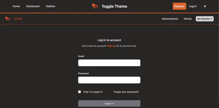
finally the forgotten password link on the sign-in page:
# lib/darktoggle_web/live/user_login_live.ex
  def render(assigns) do
    ~H"""
    <div class="mx-auto max-w-sm">
      <.header class="text-center">
        Log in to account
        <:subtitle>
          Don't have an account?
          <.link navigate={~p"/users/register"} class="font-semibold text-brand hover:underline">
            Sign up
          </.link>
          for an account now.
        </:subtitle>
      </.header>

      <.simple_form for={@form} id="login_form" action={~p"/users/log_in"} phx-update="ignore">
        <.input field={@form[:email]} type="email" label="Email" required />
        <.input field={@form[:password]} type="password" label="Password" required />

        <:actions>
          <.input field={@form[:remember_me]} type="checkbox" label="Keep me logged in" />
          <.link
            href={~p"/users/reset_password"}
            class="text-sm font-semibold p-2.5 rounded-lg dark:text-zinc-300 dark:hover:bg-zinc-700"
          >
            Forgot your password?
          </.link>
        </:actions>
        <:actions>
          <.button phx-disable-with="Logging in..." class="w-full">
            Log in <span aria-hidden="true">→</span>
          </.button>
        </:actions>
      </.simple_form>
    </div>
    """
  end
end
Now all the basics for login and the main page are fixed. However, in a real app you need go through and test all core_components and pages for light- and dark-mode.
Resources:
- Tailwind CSS v2 (Phoenix v1.7.14) - https://v2.tailwindcss.com/docs/dark-mode
- Tailwind CSS color pallet - https://tailwindcss.com/docs/customizing-colors
- Tailwind CSS v3 - https://tailwindcss.com/docs/dark-mode
- Phoenix Dark Mode repo - https://github.com/aiwaiwa/phoenix_dark_mode
Bill Tihen
Developer, Data Enthusiast, Educator and Nature’s Friend
very curious – known to explore knownledge and nature